Chapter 9 of Design: A Very Short Introduction, by John Heskett, talks about how design has helped some companies distinguish themselves. I thought it was interesting how it is easier for large companies to distinguish themselves. On the other hand, small and medium enterprises (SMEs) either have to change their products to adjust to trends or use design to create a new market (116-7). One example of this is the Oxo Goodgrips brand, which I have often seen at stores and I notice that many companies have now come out with products similar to the Goodgrips products.
This chapter also discussed how governments and rules have incorporated design into their principles. I found it interesting how at the end of WWII, the UK established the Council of Industrial Design. This council functioned through persuasion and eventually died down to a smaller body. In Denmark, the Danish Design Centre was established at the end of WWII, and has been an important factor in the design of the Danish economics as well as their society. I think it is interesting how the major European countries have had a design council at some point in time, when the US has never had one. I think design isn’t given enough importance in the US Government and is just left up to companies and design firms. I didn’t realize how many countries have a design support program set in place by the government.
The last chapter of the book discusses the future of design. The advancement of the computer has made significant contributions to the field of design. It is amazing to think of what developments will arise in the next ten or twenty years as computers and their technologies will continue to advance. Also, as parts of the world become more impoverished, more design advancements will be made to adapt to all different types of cultures.
As more and more products are made, will the basic needs of humans eventually be met? What will designers do then? It is interesting to think if we will eventually reach a point where humans are content with all products and processes where no more advancements need to be made. Only time will tell!
Tuesday, May 31, 2011
Journal 10: Course Reflection
I really enjoyed the course Design 200. I feel that it was a good introduction to design and gave me a feel for what to expect as being a part of the Design Program. I was introduced to some new concepts and saw some very interesting videos about design and how to design for all types of people and cultures.
I feel like the course load was just right, there wasn’t too much to do for a 5 credit hour class, but I still felt like a have a good, general understanding of design. I also thought there was a good balance of individual and group work.
One think that I didn’t like was the readings. I felt like the books just rambled on and were saying the same thing that we were learning in class. I feel like watching some assigned videos instead of reading would be interesting because I think that the videos broadened my knowledge and interest in design more than the readings.
Overall, I really enjoyed the course and I am excited to take more of my design classes!
Journal 09: Coleman Project
The past couple weeks of class have been spent working on the Coleman for the Home Design Project. The assignment was for Coleman to create a product for them to enter into the home goods market. We were assigned groups based on our cards we drew at the beginning of the quarter, and I was in a group with Becky, Jonathan and Lindsay.
The first class was spent defining Coleman, what their values are and who their customers are. We decided that Coleman is an outdoor goods company that produces quality products that are also environmentally friendly. Their customers are adventurous people who are also concerned with saving the environment.
We then started to think about some home goods products that Coleman would be interested in making. We came up with some of the following ideas:
o A lamp that used solar power as its source of electricity
o A coffee table that had an outlet on it powered by solar power
o A “power mat” that could wirelessly charge electronics that was powered by solar energy
o Coleman Fabrics that are able to heat, cool and power whatever was set on them
o A set of drapes that used the sun’s energy to wirelessly power an outlet
Overall, we wanted to go with the idea of using solar energy to help customers save money while also being environmentally conscious.
I would say my role in the team was the “naysayer.” As a team, we came up with some very creative ideas. I am an engineer so my mind was constantly thinking about how possible these ideas would be to make and how well they would function. There were some ideas that I think are really cool, but probably too futuristic for a product to be released soon. I think that overall, our product is a good idea that will be possible to make in the near future.
I think that my team worked really well together. We had a good balance of creative ideas but also ones that would be possible. Also, Jonathan was able to learn enough about Google Sketch-Up to create the kiosk model. Becky created the logo and packaging and Lindsay looked up information about the technology and created some informational slides.
I created the “plug box” on Google Sketch-Up (see below) and also made some sketches for the product logo and Coleman logo. Also, Lindsay and I worked on our Prezi, which was our presentation that we showed to the class.

I think that this was a good way to wrap up the quarter and get a preview as to the dynamics of working in a group on a design project. I think that our group worked really well together and we came up with a good idea for a product that Coleman customers would be interested in!
Wednesday, May 25, 2011
Course Reflection 05
The last two classes of the quarter were spent presenting our Coleman for the Home Projects. It was very interesting and fun to see all of the groups and the cool ideas that they came up with.
Team 2 had an interesting idea with the HotTop indoor kitchen, and I could see it as something that I would want to use. I was a little confused when the group showed the sketch of the Coleman product that already existed, because it seemed very similar to their product that they came up with.
Team 3 proposed a desk storage unit that I found really interesting. It seems like something I would like to use, or I could see my younger siblings liking.
Team 5 had the idea of creating a twin bed design that brings the outdoors in. It was a really cute idea and I could see someone using it to decorate their kid’s room if they wanted an outdoor theme.
Team 6 designed a table/hammock that can be used in small spaces. I think this is a really good idea because it is difficult to find tables that can fit into small spaces. I alto thought the hammock idea was cool because it is a interesting way to incorporate seating into an existing item in your house.
Team 7 designed a bowl that is able to collapse to save space. I think this is a good idea and something that I would use in my dorm room or kitchen.
Team 8 came up the idea of creating the EcoStat plug adapter and app. I think this is a really cool, revolutionary idea that a lot of people would use. As long as it is user friendly and simple to use, I think this idea could become really popular.
Team 9 designed the Elements white board lamp. I really like this idea and I would definitely buy this if I saw it. I think adding a plug to power the lamp inside and also batteries for outdoor use would make this product more versatile.
Team 10 proposed the nature hiking treadmill. I think this is an interesting idea for a new video game and it was cool that they thought of partnering with Wii.
Team Jacks had the idea of the versatile utensils. I think this is a good way to save space in the kitchen with utensils that are not used very often, such as a whisk, spatula and strainer. I also liked how the packaging was also part of the product.
Team Queen came up with the idea of the green lantern. I think it was a cool idea to have a lantern that looks like a home décor product.
Team King designed the space saving cook top and table. I really liked this idea and I think they did an awesome job with their graphics. I thought they did a lot of research behind the induction cook top and it seems like a really cool technology.
Team Ace designed the deluminator, which is a device used to remove light bulbs form ceilings, along with attachments to paint ceilings and dust ceilings. I think this is an interesting way to combine a lot of different products.
Overall, I think everyone proposed really interesting products and I enjoyed listening to people’s presentations.
Sunday, May 22, 2011
Journal 08
For this journal assignment, I decided to explore the idea of “design like you give a damn.” This is the concept of designing for the improvement of the world, especially for those parts of the world that are living in poverty and in substandard conditions. I think that this is an important part of design that is just starting to become popular in the design world. It is one thing to make all of these new designs and products, but they must be able to be used by people. When we design for people who don’t really have anything, this product becomes so much more valuable and useful.
The first source I found is from INDEX:, a non-profit organization that works to promote and apply the idea of “designing to improve life.” I found an article on their website that discusses their design process that they use in order to create products that will truly improve the lives of people. It is a really interesting article because it describes how form, impact and context combine to design to improve life.
INDEX: Design Process
INDEX: holds a design competition and give the Design to Improve Life Award to designers who come up with ideas that exemplify the ideas of INDEX:.These awards are presented in the areas of body, home, work, play and community. I found an online book that describes the winners in each of these areas and their design. This book is really interesting because contains some interesting elements and products that I originally didn’t consider in the field of design, such as a book and an exhibit.
INDEX: Awards
After seeing some examples of designs that improve life, I found a few videos of interesting takes on the design of everyday products.
First, I found a video describing a new type of drywall that is better for the environment. 40% of carbon emissions are due to building operations. The video explains the process and future of a drywall that is clean and recyclable. This video also contains interesting facts about the process of building a home and how detrimental it is to the environment.
Drywall Video
The next video I found is about the process of growing your own clothes. This is a very interesting new process that has huge potential in the future. Organisms harvest into a material, which is like leather, which can then be sewn and formed into clothing. There is one major drawback to this design, but it has huge potential for the clothing market, or even the entire manufacturing processes.
Grow Your Own Clothes
The last video I found takes design to a whole new level. It describes the organization Project H, which works to improve the public education system. This organization is now stationed in Bertie County, NC, which is an impoverished area with a low emphasis education. The designers at Project H are looking into ways to redesign the education system to improve the lives of the children.
Designing Education
Overall, I have found some very interesting articles and videos about “designing like you give a damn.” I think it is important for students to learn some of the benefits and factors of designing for everybody in the world, not just the select few who have money to purchase high end, technological products.
Course Reflection 04
The last four classes have been work sessions for our Coleman for the Home Project. I think this project was the perfect way to wrap up the quarter because we are working on a project that encompasses the three areas of design: product, interior and visual and communication.
I have really enjoyed having time to work on the project in class. I think it was beneficial to have the long brainstorming sessions that my group did and it was very convenient to be able to do these in class. The first two days, we were brainstorming ideas and trying to figure out the specifics of our product. During the third class, we discussed ideas for the packaging and the kiosk for the product. In the last class, we shared our work we did on the computer to model our ideas.
I will talk more about the process of the project in my Journal 9, but the work my team completed in class has been extremely productive and beneficial to the process of our project.
Sunday, May 15, 2011
Reading Reflection 03
I found the book Cradle to Cradle very thought-provoking. These days, the major phrase is “reduce, reuse and recycle.” I thought it was interesting how the authors disagreed with this statement. William McDonough and Michael Braugnart believe that the best way for a product to be designed is that at the end of its life, it can be reused to make something of equal or better quality.
This is the concept of “upcycling,” which is a term that I have never heard before. I thought this was an interesting concept because with recycling, eventually a product will be thrown away after one or two lives, but this is not the case with upcycling. An average television is composed of 4,360 chemicals. Some of these chemicals are able to be reused and are valuable, while others are toxic. Isolating the valuable elements from the toxic ones would allow them to be upcycled and create a system of quality materials (110).
I also thought it was very interesting how they viewed the Industrial Revolution. So far in my classes, the Industrial Revolution has been portrayed as a mostly positive event. In my industrial engineering classes, the Industrial Revolution was the key event to all of the processes I am studying. In this book though, the Industrial Revolution is viewed as a system that “put billions of pounds of toxic material into the air, water, and soil ever (18) ” along with creating regulations to prevent people from being poisoned. When you think about it this way, the Industrial Revolution sounds like an extremely negative event in the development of the modern world.
I often think about the damage that humans have done to the world in the past 60 years and it is shocking. Personally, I find it scary because if changes are not made to the way that we design products and systems, the world will be drastically different in 60 more years.
I also like how the concept of biomimicry was also discussed in this book. In the example of the cherry tree (72), the fallen blossoms can be considered waste, but instead people see them as beautiful. These blossoms are then decomposed and provide nourishment to many organisms. The authors mention the idea of designing our systems and products this way, where the “waste” is beautiful and in touch with nature.
While reading the book, I was shocked by the multiple references to the danger in the products that we use everyday. One example is the natural indigo dye, commonly used to die jeans, contains mutagens that deplete genetic diversity (42). Other examples of dangerous materials are plastic water bottles and polyester shirts (38). These dangers just make me wonder if humans are becoming too scientific and if we are really just screwing ourselves over by constantly developing new materials and methods to improve existing products.
One section of this book that I found interesting was Chapter 5: Respect Diversity. I feel that when trying to create the optimal design for a product or system, the “bad models” would be eliminated, while eliminating diversity. I thought it was interesting how there are over 8 thousand species of ants in the world. Even though an ant appears like a simple system, 8 thousand different types are needed in order for it to survive in different places and by doing different tasks (120).
Overall, I thought this book made me think about some of the products that I use everyday and how they could be designed better to have a positive impact on the environment and user. I did feel like the book was pretty repetitive though and I got bored at some parts. Even though I thought the plastic pages were cool, I found the book heavy and hard to hold open.
Journal 07: Peer Dialogue #3
Jonathan
The first thing I noticed when I went on Jonathan’s blog was the cool videos he has posted about new screen and device technology. These videos show a flexible phone that works by bending the screen to press the buttons. I think this is an interesting idea and I look forward to seeing if anything comes out of it.
For the home goods assignment, Jonathan posted a picture of a really unique coffee machine. I would be interesting in learning how this specific machine works and how expensive it is.
I also agree with Jonathan about enjoying the classes with the speakers. I think its cool how he has already used Prezi for one of his presentations.
You can see Jonathan’s blog at: http://design200.wordpress.com/
Lindsay
I enjoyed reading Lindsay’s thoughts on the last couple classes. I agree with her about the competitiveness of the design program here and enjoyed hearing from the students about their experiences in the program. I also thought it was cool how Lindsay enjoys picking out the colors to paint her house. My mom always asks me to help her pick out colors but it usually turns into too long of a process for me!
While looking through her trade show pictures, I really liked the IKEA exhibit. I think this it is a really creative approach to making a room by using large magazine covers instead of walls. This attracts people to the exhibit and in turn, will help to sell your products.
I also thought it was interesting how we had some of the same items for our letters. For example, we both used glasses for “b” and we both used a lamp for a letter.
You can see Lindsay’s blog at: http://design200lm.blogspot.com/
Becky
There are many things from Becky’s blog that I enjoyed looking at, such as her letterforms and her course reflection. I thought that her letter “A” was very creative because you usually don’t look at a magnetic clip from that direction. Also, her “y” is part of a lofted bed that I also have in my room and I didn’t notice it when I was looking for letters. I thought it was cool how she took the number “3” and rotated it to look like a “w”.
I share many of the same thoughts as her about the Rip!: A Remix Manifesto movie we watched in class. I thought I was disappointing learning how Walt Disney copied his ideas from other pieces of media then copyrighted them to prevent people from doing the same. I also think it is ridiculous how “Happy Birthday” is not public domain. It is things like this that just make me frustrated with how ridiculous some laws and regulations are today.
You can see Becky’s blog at: http://bbeaulieu11.blogspot.com/
Sunday, May 8, 2011
Journal 06: Online Scavenger Hunt
This journal focuses on outdoor and indoor products.
The following are links to 5 websites to companies who sell outdoor camping or recreation equipment:
Coleman- sells mainly camping equipment
http://www.coleman.com/
Gander Mountain- store that sells hunting and outdoor equipment
http://www.gandermountain.com/
LL Bean- sells clothing and equipment for outdoor use
http://www.llbean.com/?nav=gn
Cabelas- hunting and fishing store
www.cabelas.com
North Face-sells clothing and equipment for outdoor use
www.thenorthface.com
The following are pictures of booths at outdoor trade shows:

Transformit. “The North Face Exhibit at Outdoor Retailer Winter Market 2011”. http://blog.transformit.com/

Martin Oberhauser. “Adidas Outdoor Trade Show Booth.” http://www.behance.net/gallery/Adidas-Outdoor-trade-show-booth/681578?sms_ss=twitter&at_xt=4d4da29b1e2de848,0

Jervis Bay Kayak. “JBK Team- US Outdoor Trade Show.” http://jbkayak.blogspot.com/2009/07/jbk-team-us-outdoor-trade-show.html
The following are 5 links to home goods retailers:
Home Goods- sell home goods
www.homegoods.com
IKEA- sells furniture and accessories
http://www.ikea.com/us/en/
Crate & Barrel- sell home décor, furniture and accessories
http://www.crateandbarrel.com/default.aspx
Pottery Barn- home furniture and décor
www.potterybarn.com
Williams Sonoma- sell cooking equipment and kitchen accessories
http://www.williams-sonoma.com/
The following are images from indoor goods trade shows:

“Best Kitchen Table Designs in International Kitchen Expo and Exhibition.” http://www.trade-exporter.com/kitchenbath/best-kitchen-table-designs-in-international-kitchen-expo-and-exhibition.html

“Saudi International Furniture, Interior Design & Home Decor Expo”.
http://www.facebook.com/photo.php?fbid=212102308809003&set=a.212102145475686.61390.138017522884149&type=1&theater

http://blog.marbleandgranite.com/files/2011/01/179053_10150122904834595_346740069594_7634539_3196222_n.jpg
My definition of a home good is a product that is placed in a home to provide a function or a feeling. Examples are appliances, furniture and decorations.
The following are images of different home goods.

Appliance Repair Miami Site. http://appliancerepairmiamisite.com/

Guide to Home Furniture. “Essential Home Furniture”. http://www.roundtreeandrichardson.com/tag/home-furniture.

“Wall Décor for the Home.” http://www.home-decorator.tk/latest-about/wrought-iron-bed-description
Wednesday, May 4, 2011
Course Reflection 03
In the last four classes, we have learned a lot about design, legal issues and the program at Ohio State. I enjoyed the lecture on color and the slides that showed all the different ways to find color combinations. I never thought of color palettes as being made through a method of choosing complementing colors.
I also thought the lecture on legal issues was interesting. I have heard of patents and trademarks but I never knew the difference between the two. Also, I didn’t know that the patents only last a certain number of years.
We also watched the video Rip!: A Remix Manifesto. I thought this video was intriguing. I didn’t like the randomness of the video and how there were so many random clips and music layered on top of each other in the video. I did find the topic of the video very interesting. I have always wondered how mash-ups are made and how they are legally able to use clips from other people’s songs. I didn’t feel as if the video gave a clear explanation as to how Girl Talk is able to use other’s music.
We also had speakers come into class from Design Circle and Cobego. I liked how Design Circle came in because I learned more about the design program at Ohio State. I wasn’t aware of the entrance exam that is required to be admitted into the Design School.
Cobego is a design firm that was founded by 5 OSU grads. I enjoyed looking at the projects that they have done and seeing how design can be applied in the real world. I also liked how they are industrial designers and that is what I am interested in.
Assignment 04: Letterform Seek and Find
The following are images I found around my room of objects that look like letters of the alphabet. I put the photos in black and white because I found it was easier to focus on the shape of the object rather than all of the colors.

Science googles that look like a "B"

A drawer handle that resembles a "C"

A pencil cup that looks like a "D"

My dryer rack looks similar to an "E"

My desk lamp looks like an "i"
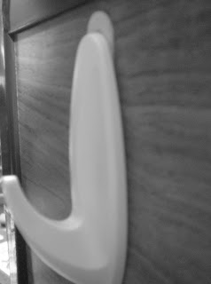
A hook on my bed resembles a "J"

My towel hook looks like an "L"

My stapler looks like a "M"

A cheerio resembles an "o"

My headphones look like a "P"

My bed resembles a "T"

My tv stand looks like a "X"
Thursday, April 28, 2011
Journal 05: Peer Dialogue #5
Jonathan
Jonathan has added a lot to his blog since I last saw it. I noticed that he took away his fashion page and changed it to a Street Art page. I think this is a really cool idea because there are so many cool designs that have been painted on buildings around Columbus.
I also like how one of his designers was NASA. I didn’t really think of NASA as a designer but I realized that they are probably one of the most advanced technical designers. Their ability to think outside of the box and create new things has made it possible to go to the moon!
You can see Jonathan’s blog at:
http://design200.wordpress.com/
Lindsay
I agree with Lindsay about being interested in designing to help others. I also found the baby incubator a really cool product that has the ability to save lives.
I also liked Lindsay’s pictures of the found faces on campus. I especially like the one of the lookout binoculars, because I remember seeing those at different tourist places and thinking that they do look like a face.
I thought it was interesting how she talked about designer brands in her Reading Reflection 01. I know that I have the problem where I am attracted to brand name items because I think they are better than non-brand names. I know that this isn’t necessarily true, but I can’t seem to break my shopping habit!
You can see Lindsay’s blog at:
http://design200lm.blogspot.com/
Becky
I thought it was funny how I had a lot of the same “found faces” photos as Becky. We both took pictures of outlets and microwaves. I think that because a lot of us were looking around dorm rooms, we came across the same faces.
In her Course Reflection 02, Becky also mentioned all of the creative ways people have thought of to make the world a better place. One part that I really enjoyed was the idea of putting gardens on the roofs of buildings. I think that this is a really abstract idea, but one that would work well.
I also like the picture of the “Bookworm” bookshelf she has under her Designer Investigation assignment.
You can see Becky’s blog at:
http://bbeaulieu11.blogspot.com/
Reading Reflection 02
I finished reading the end of “Design: A Very Short Introduction” by John Hesektt and also started reading “Cradle to cradle” by William McDonough and Michael Braungart.
I found a couple of things very interesting in the “Identity” section of the first book. A part of the section discussed how it is important to keep the culture of the people you are designing for in mind when designing a product. For example, washing machines in India are designed to be able to wash long saris that are often worn. Also, a soak cycle was added to washers in Brazil to tend to the belief that only soaking a garment can really clean it.
I also liked when they talked about the design of Apple’s packaging. I have found many times that I am amazed by how simply and creatively Apple can package a product. I think this says a lot about a company: the fact that they are willing to put effort and money into the packaging design.
When I was reading the “Systems” section, I realized that I never thought about how much design and planning goes into transportation. Other than the physical system itself, there is a lot of thought that needs to go into designing the signs and instructions on how to use the system.
While reading “Cradle to Cradle”, I found it very disturbing how dangerous our common day items are. They mentioned all of the chemicals in the soles of shoes and how whenever we walk and kick up dust, we are releasing toxins in the air.
I also thought the statement in the end of the section about ants was very intriguing. “Ants have been incredibly industrious for millions of years. Yet their productiveness nourishes plants, animals and soil. Human industry has been in full swing for little over a century, yet it has brought about a decline in almost every ecosystem on the planet” (16).
I have often thought about this fact. If you think about how much humans have changed the planet in the past 100 years, it is scary to think what the world will be like in 100 years. I feel like humans have created so many new products and technology, but I feel like we have done significantly more harm to the planet than good. I am looking forward to reading more of this book.
Sunday, April 24, 2011
Journal 04: Found Faces
These are pictures I found around campus of things that look like faces!

The side of the Math Tower

A faucet

Paper Towels

The SEL

A microwave

An outlet

The side of the Math Tower

A faucet

Paper Towels

The SEL

A microwave

An outlet
Wednesday, April 20, 2011
Course Reflection 02
I have found these last four classes very interesting. I like how we have moved on from the basic definitions and types of design and are starting to explore the ways design is applied in a greater context, such as accessibility and design for the world.
In one class, we watched the video “The Deep Dive.” After starting the video, I remembered that I have already seen this video in one of my engineering classes. I found it interesting that even though I thought the “Deep Dive” design process was only applicable to engineers, it also involves industrial designers as well. I really like this video because it gives an overview of the design process and kind of answers the question “How did they come up with this?”
I also really enjoyed the lecture on accessibility. I found it interesting how some products are designed for handicapped people, but often these also help the general public. I thought the video on the new wheelchair was very inspiring, although it is a shame that the product is not surviving on the market.
The next lecture consisted of our Scavenger Hunt. I really liked getting outside of the classroom and exploring all of the famous buildings and pieces that are on campus. I also really like the fact that the libraries on campus have some of these expensive designer chairs. I think it is a nice touch to the libraries!
The last lecture was probably my favorite so far. We discussed creating environmentally friendly products. I really liked all the videos that we watched in class. My favorite was probably the video on the new Life Saver Bottle. I think this is a really cool design and I hope it becomes popular in areas that need it. I also really enjoyed the video on biomimicry. Sometimes I am amazed about the complexity of nature and the ecological systems and I was neat to learn more about it.
Overall, I have enjoyed this class and look forward to more lectures!
Tuesday, April 19, 2011
Assignment 03: Scavenger Hunt
For the third class assignment, we were required to go around campus and take pictures of elements created by famous designers.
Clue 1:
The first clue led to the Barcelona Chair, designed by Ludwig Mies van der Rohe. This chair was found in the Knowlton library. One interesting fact that I learned about the chair is that it was designed to be used by the King and Queen. The accompanying stool, on the other hand, was designed for the attendants.

Sitting in the Barcelona Chair
Clue 2:
This clue required us to take a picture of another interesting chair we found in the library. We found the Red & Blue Chair, designed by Gerrit Reitveld in 1918. One interesting fact I learned was that the original of this chair was painted black, gray and white. My classmate is reading a copy of Harvard Design Magazine.

Catching up on design news in the Red & Blue Chair
Clue 3:
The third clue led us to the Wexner Center, which was designed by Peter Eisenman. I learned that there was a problem with the large west facing windows of the building. Too much sunlight was entering the building so the windows had to be redone.

The Wexner Center
Clue 4:
We then went to the Math Tower, which was designed by Phillip Johnson. We also found the circular windows on the face of the building a very interesting element on an academic building.

The Math Tower

The interesting circular windows and arches
Clue 5:
The last clue led us to the William Oxley Thompson Library on the Oval. Acock & Associates designed an addition to this building. One interesting fact about this library is that the original design team was selected in 1910 by winning an architectural competition.

Thompson Library
Sunday, April 17, 2011
Journal 03: Peer Dialogue #1
For this journal, I looked at some of the other blogs of my classmates. Here are my thoughts:
R.Becky_B
I looked at Becky’s blog and the first thing that I noticed was the cool picture of tree bark that was part of her pattern assignment. I really like all of the patterns that she found because they are all common designs that I feel like I have seen before.
I also agree with her statement of not realizing the entire realm of design, from industrial to interior to visual communication. I also really liked how we were able to see the chairs that we learned about in class in the libraries on campus.
To see Becky’s profile, go to: http://bbeaulieu11.blogspot.com/
Lindsay_M
After looking at Lindsay’s profile, I have found that we have very similar ideas about the course. I really like what she said about knowing some of the history of the buildings on campus. When we went on the walking tour, we learned some fun facts about the libraries, such as how there are no right angles in the Wexner Center.
I also really liked the patterns that she had on her blog. A lot of them were on similar products where I found my patterns, such as the mosaic candle holder, clothes and purses.
I found it interesting that she also did her designer project on Jonathan Ive. I feel like a lot of students researched him.
To see Lindsay’s profile, visit: http://design200lm.blogspot.com
Jonathan_T
Jonathan is the fourth member in my group of 4s. I was surprised when I visited his blog because he uses it for more than this class so there is a lot on it. When I looked at his J02 with the patterns, I noticed that a lot of them are from articles of clothing. I think that a lot of people found their most interesting patterns on clothes because they are products that they bought because they were attracted to.
I like how Jonathan has a Campus Style section on his blog. I look forward to checking back and seeing what styles he has observed on campus.
I think his blog looks very professional and he has a lot of material on it. To see his blog, visit: http://design200.wordpress.com
Assignment 02
I found three designers that I found very interesting. They are listed below, along with a biography and some pictures. Enjoy!
Jonathan Ive (longer bio):
It is no doubt that the Apple products have become among the most popular items desired by people today. This is due to the sleek designs created by Jonathan Ive, the Vice President of Industrial Design at Apple. Jonathan has been the star designer at Apple for 14 years, creating products such as the iMac, Powerbook, MacBook, MacBook Pro, iPod, iPhone and iPad. His design and new approach to technology have turned Apple into the second largest company in the world.
Ive was born in Chingford, England in 1967. In high school, Jonathan played rugby and was often called a “gentle giant.” He was known for always being up to a challenge. He was originally interested in designing cars, but once he got to art school, he thought the other art students were too weird. After graduating, he started working at a small design firm, and was later offered a job from Apple.
When he started working for Apple, the company was not doing well and he was working out of the basement of his house. Things started improving for Ive and Apple when Steve Jobs returned to Apple in 1997. Jobs got rid of the bad products that were being made by Apple and was impressed by all of the prototypes that Ive had designed. Jobs decided to move Ive’s office to the Apple building and to seriously consider Ive's prototypes. Security was increased within the company; so much that other Apple employees are not able to see Ive’s prototypes.
Apple started taking off with Jonathan Ive’s new, colored design of the iMac in 1998. When the first iPod was made in 2001, the Apple “minimialist” vibe was born. Ive started to work to make every product lighter and smaller. Since 1996, he has lead the design team at Apple. Along with his team of 12 designers, Ive works to design new products, many of which don’t make it out of the design studio.
Jonathan Ive has grasped the concept of design that Apple and many consumers are looking for. He works to find the “true appeal of a product” and figure out what people are looking for. When designing, Ive puts the user first and creates a product based around them and what they want. He believes “design drives the technology, not the other way around.”
Ive is a well-respected industrial designer. According to design expert Stephen Bayley, “[Ive] thinks and thinks about what a product should be and then worries it into existence.” Bayley also says the Ive understands that a “consumer is a sophisticated aesthete who will cheerfully pay a premium price to own products that flatter by their pristine beauty and sparkly intelligence.” This desire for beauty and intelligence has been portrayed in Ive’s products today. Ive was also awarded the RSA's Faculty of Royal Designers for Industry. Judges said “his designs make computers accessible. When you see an Ive product you think, yes, that's how that should have looked all along. I want to use it.” He was also awarded the Industrial Designers Society of America's Industrial Design Excellence Award.
Jonathan Ive has been one of the most influential designers in the past two decades. The whole field of technology has changed due to his vision of sleek products that work well and attractive. I know I am always looking forward to the next Apple product, hoping that Jonathan Ive has created something else that is unimaginable.

Jonathan Ive

Ive's revolutionary design of the 1998 iMac
Works Cited:
“Apple yum poster”.
Arlidge, John. “Father of Invention.” The Observer.” Web. 21 December 2003. 17 April 2011.
“Jonathan Ive.” Press Info. Apple Inc. April, 2006. Web. 17 April 2011.
Waugh, Rob. “How did a British polytechnic graduate become the design genius behind £200billion Apple?” The Daily Mail. Web, 20 March 2011. 17 April 2011.
Michael Graves (shorter bio):
Whenever I go to Target, I make it a point to stop and look at the Michael Graves products. Michael Graves was born in Indiana in 1934. He is know for being one of the New York Five architects and his many architecture, drawing and product projects.
As a child, Graves was interested in drawing and painting. Graves attended the University of Cincinnati. He then went to Harvard University and received a Master of Architecture. From there, Graves attended a fellowship program at the American Academy in Rome. It was in Rome where Michael Graves learned the “language of architecture.” In 1962, Graves returned to the United States as a lecturer at Princeton University. He then opened his own practice in 1964.
Michael Graves has designed a wide variety of projects, ranging from the “ministructure to megastructure.” He has designed many buildings, such as the Portland Building in Oregon, Resorts and Hotels for Disney, many halls for different universities. Graves has also become a common name because of his household products now sold at Target Stores. He has designed the Target Design Collection, which consists of 200 kitchen, cleaning, storage and home décor products. Graves says “Target products are an inspired balance of form and function created to infuse our daily lives with great design and joy.” He has also published many pieces of literature.
Michael Graves has been awarded the National Medal of Arts, the American Institute of Architects Gold Medal and many more product design awards.

Michael Graves

Target Tea Kettle
Works Cited:
“Michael Graves.” archINFORM. N.p. 18 Feb 2011. 17 April 2011.
“Michael Graves.”
“Michael Graves.” Modern.architecture.sk. n.p,n.d. Web. 17 April 2011.
“Michael Graves”. Target.com. Target Designers Shopping Directory. N.d. 17 April 2011.
“Michael Graves.” Wikipedia.org. Wikipedia, 6 April 2011. Web. 17 April 2011.
“Michael Graves Target Tea Kettle”
Fred and Friends (shorter bio):
There have been several stores that I have been at where I have run into the Fred products. The company Fred and Friends, started by Fred Roses, designs and markets everyday products with a creative twist. Their studio is in Cumberland, Rhode Island and it is there where the ideas of senior designer, Liz Dubois, are put to work. Founded in 2004, this is a fairly new company. One can see from their products, that there are extremely creative designers working at Fred.
Their unique products have been featured in many magazines, such as Rachael Ray, Oprah and People. Also, their products have been displayed on the Today Show.
On their website, worldwidefred.com, Fred posted a message saying that they produce “stuff that works, puts a smile on your face, and doesn’t cost a fortune.” Many of their products are designed with a theory of play on words. For example, their “Peace of Cake” cake pan is in the shape of a piece sign. The products are designed with the idea of being perfect, quirky gifts to give to people.

Tank Up Coffee Cup

To Do Tattoos

Air Fork One
Works Cited:
“Airfork One™.” Worldwide Fred.
“Fred and Friends.” Worldwidefred.com.
Hollands, Courtney. “Coming up with the latest in truly off-beat items? It's a gift.” The Boston Globe, 18 Sep 2008. Web. 17 April 2011.
“Tank Up™”. Worldwide Fred.
“To-Do Tattoo ™”. Worldwide Fred.
Friday, April 15, 2011
Reading Reflection 01
While reading “Design: A Very Short Introduction” by John Heskett, there were a lot of interesting facts that I learned about design. I thought the quote about design being an “essential determinant of the quality of human life” (2) is a good definition of design that shows how it is more than just a drawing or logo.
Design is such a vast topic that it is hard to really see how it fits into your life. It can either be designing a product, a feel or a space. I feel as if I don’t necessarily notice good design, but I definitely recognize when something is designed poorly.
I thought it was very interesting how the reading talked about the history of humans and how design has been a huge component of that. We are the only creatures on this planet that have the capability to change the world this much. Humans themselves have not changed, but yet it is interesting to see how the world we have lived in has changed drastically. One major development was the realization that humans could use other sources of power (animals, water, wind). This was a crucial step and our world today is based off of this. I think that when you think of design in this way, it gives it such a greater importance than just being an art field.
I also found it very interesting when the book was discussing the difference in design in homes in different cultures. It mentioned that design in American homes is usually less detailed than smaller homes, for example in Japan, because the space doesn’t need to be used as efficiently. There was also a section on designing office spaces. I was intrigued when they were talking about how companies had decided to have their employees work at home. Companies have adapted to this with design and technical changes in the offices.
Sunday, April 10, 2011
Course Reflection 01
So far, I have really enjoyed this class. I thought it was interesting to learn how design has evolved over the years. For another one of my classes, I had to write a paper about the history of industrial and systems engineering (ISE) and I noticed a lot of similarities between the history of ISE and design. Mass production was crucial to the development of ISE and design because products were now being made more efficiently and all products were made in a standard way.
I also really liked the slides containing the different chairs that have been famous in design. I think it is really interesting how something so basic as a chair can be designed in so many ways. During the tours of the libraries, I thought it was really cool how Ohio State has purchased some of these chairs for students to actually see.
The two videos we have watched in class have also contributed to my appreciation for design. In my engineering classes, I have learned about cultural ergonomics, which is improving a system by learning about the culture and way of life of who you are trying to help. This was also a prominent idea in the video by Ted Brown. In order to design a product, it is crucial that the people are able to use it.
I also enjoyed the video about Paul Rand. I found it very interesting how he defined design as a combination of form and content. Before watching the video, I found it hard to define design. After hearing his definition, I think it makes a lot of sense how both of these elements need to present for product to be well designed.
I am looking forward to learning more about design during the quarter!
Thursday, April 7, 2011
Journal 02: Patterns
When asked to find 10 of my favorite patters, I immediately went to my closet. I found some of my favorite patterns on my clothes and shoes. I also have some random decorations around my room with some very fun patterns on them. A lot of these items I have had for a long time so they also have some sentimental value.
Below are my top ten favorite patterns I found:

This is a decorative candle holder that I use to hold all of my hairties and clips. I have had this for probably 8 years and I am very impressed that it hasn't broken through the years. I think it is a cool pattern made of stones and it reminds me of the cute stone mosaic tables they have in foreign places.

This is a picture of a dress I bought over winter break. I really like the pattern of the lace and the light purple color underneath.

The above is a photo of my rainboots that I bought last summer. I think they are really cute, comfortable and useful! The fun pattern also has many different colors in it so it is easy to find something to match.

The above picture is from a pair of pajama shorts that I own. I like the clean lines on them (even though they are wrinkly in the picture) and I think the colors go well together.

This is a picture of a shirt that I bought. I like the mixture of the brighter and darker colors along with the flower pattern.

This is a picture of the gift bag I got from the Coach store when I purchased a ring. I really like the colors of the stripes. I also have a slight obsession with anything Coach (including their gift bags!).
 http://images2.layoutsparks.com/1/213282/coach-slipper-shoes-design.jpg
Speaking of Coach, the above picture is from a website I found. The picture has the Coach "C"s on it in fun spring colors. I really like the Coach pattern because I like their products and it is also very simple.
 http://www.girlytwitter.com/install.asp?id=5380
This is a picture of polka dots that I found at the above website. I like this pattern because the dots are a little more complex than just normal polka dots, but they are still very simple. I also like the bright colors of the dots and I think they go well together.
 http://noveltyrugs.guidestobuy.com/delos-rugs-rovos-brown-and-tan-samburu-giraffe-rug-size-5-x-7-6
In addition to patterns on items I own, I also like patterns found in nature. Above is a picture of a giraffe print that I found online. My favorite animal pattern is that of a giraffe. I like the mix of colors and I also like how it looks as if the spots would fit together if they were closer.
 derekprospero.com
This is a really cool photo of a leaf that I had saved on my computer. I really like this photo because I can easily see the patterns of the veins of the leaf. I love being outside so looking at the leafy pattern reminds me of spending time outdoors.
Those were my top ten favorite patterns that I was able to find. Hope you enjoyed them!
Below are my top ten favorite patterns I found:
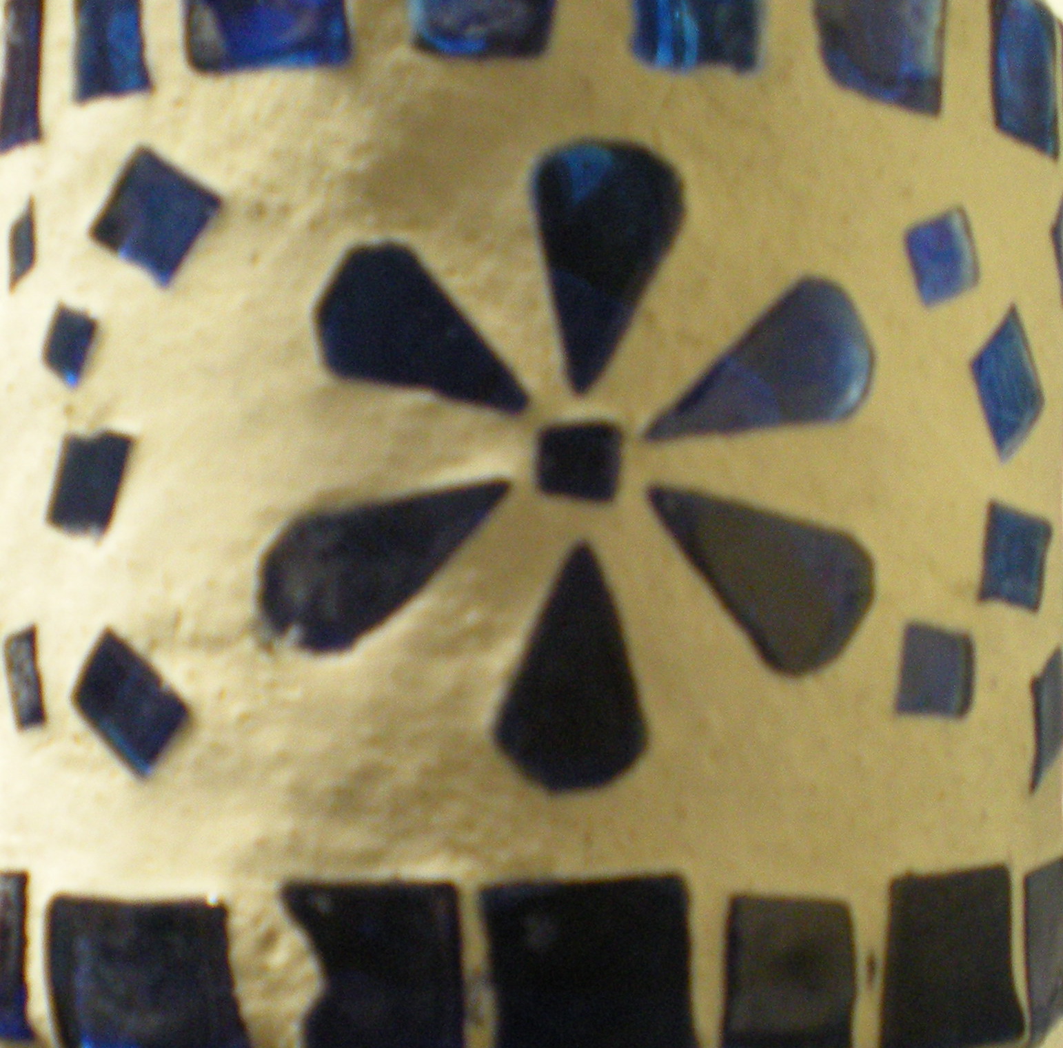
This is a decorative candle holder that I use to hold all of my hairties and clips. I have had this for probably 8 years and I am very impressed that it hasn't broken through the years. I think it is a cool pattern made of stones and it reminds me of the cute stone mosaic tables they have in foreign places.

This is a picture of a dress I bought over winter break. I really like the pattern of the lace and the light purple color underneath.

The above is a photo of my rainboots that I bought last summer. I think they are really cute, comfortable and useful! The fun pattern also has many different colors in it so it is easy to find something to match.

The above picture is from a pair of pajama shorts that I own. I like the clean lines on them (even though they are wrinkly in the picture) and I think the colors go well together.

This is a picture of a shirt that I bought. I like the mixture of the brighter and darker colors along with the flower pattern.

This is a picture of the gift bag I got from the Coach store when I purchased a ring. I really like the colors of the stripes. I also have a slight obsession with anything Coach (including their gift bags!).

Speaking of Coach, the above picture is from a website I found. The picture has the Coach "C"s on it in fun spring colors. I really like the Coach pattern because I like their products and it is also very simple.

This is a picture of polka dots that I found at the above website. I like this pattern because the dots are a little more complex than just normal polka dots, but they are still very simple. I also like the bright colors of the dots and I think they go well together.

In addition to patterns on items I own, I also like patterns found in nature. Above is a picture of a giraffe print that I found online. My favorite animal pattern is that of a giraffe. I like the mix of colors and I also like how it looks as if the spots would fit together if they were closer.

This is a really cool photo of a leaf that I had saved on my computer. I really like this photo because I can easily see the patterns of the veins of the leaf. I love being outside so looking at the leafy pattern reminds me of spending time outdoors.
Those were my top ten favorite patterns that I was able to find. Hope you enjoyed them!
Subscribe to:
Comments (Atom)